 Sign Up
This article is about Software Development
How to Create a Heatmap from Scratch in Python
By NIIT Editorial
Published on 23/07/2021
10 minutes
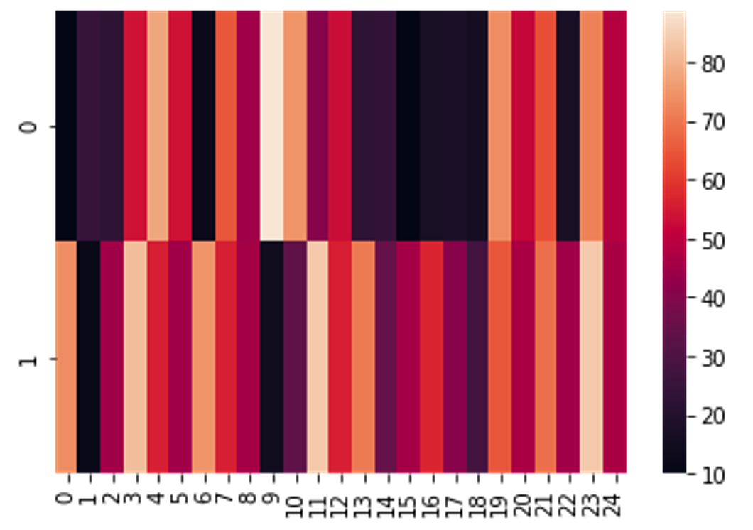
A heat map (or heatmap) is a data visualization technique that determines the magnitude of an occurrence as colour in two dimensions. The colour variation may happen by hue or warmth, showing obvious visual signs to the user about how the phenomenon is collected or varies over space. There are two fundamentally different types of heat maps: the cluster heat map and the spatial heat map. Some Python libraries or GIS tools are used to build a heatmap like QGIS, ArcGIS, and Google Table Fusion.
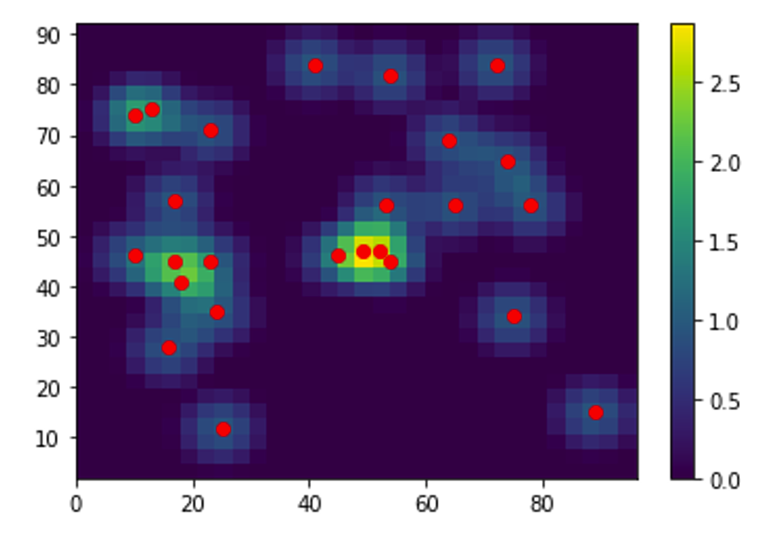
The algorithm which will be used to build a heatmap in Python is Kernel Density Estimation (KDE).
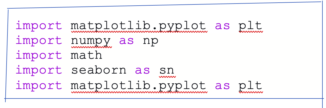
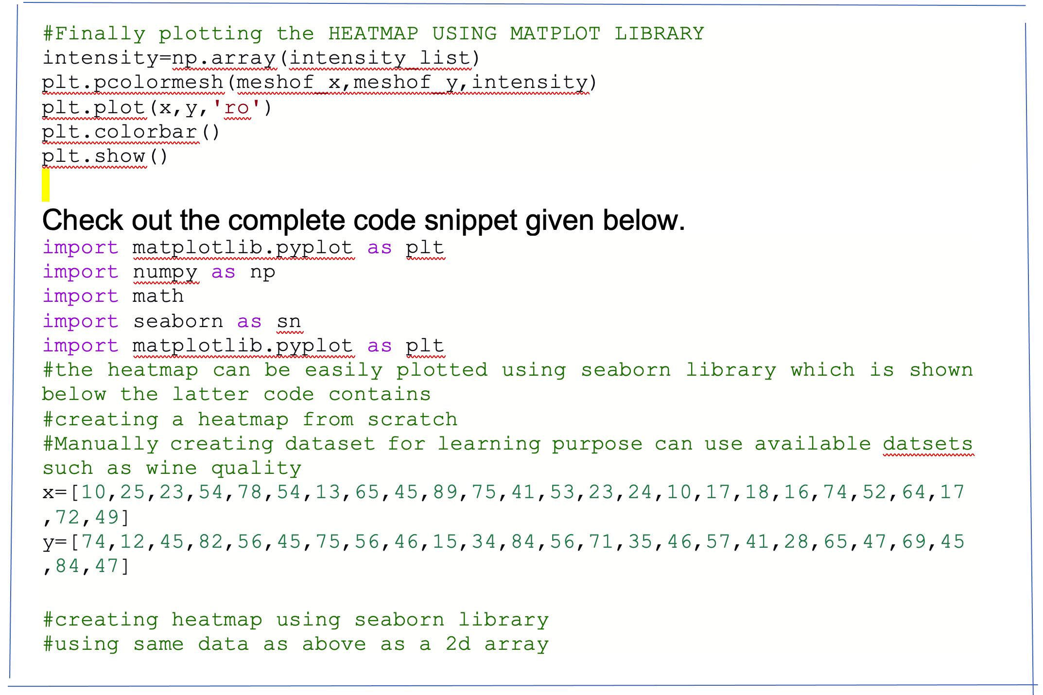
Importing Library
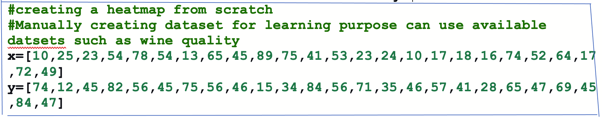
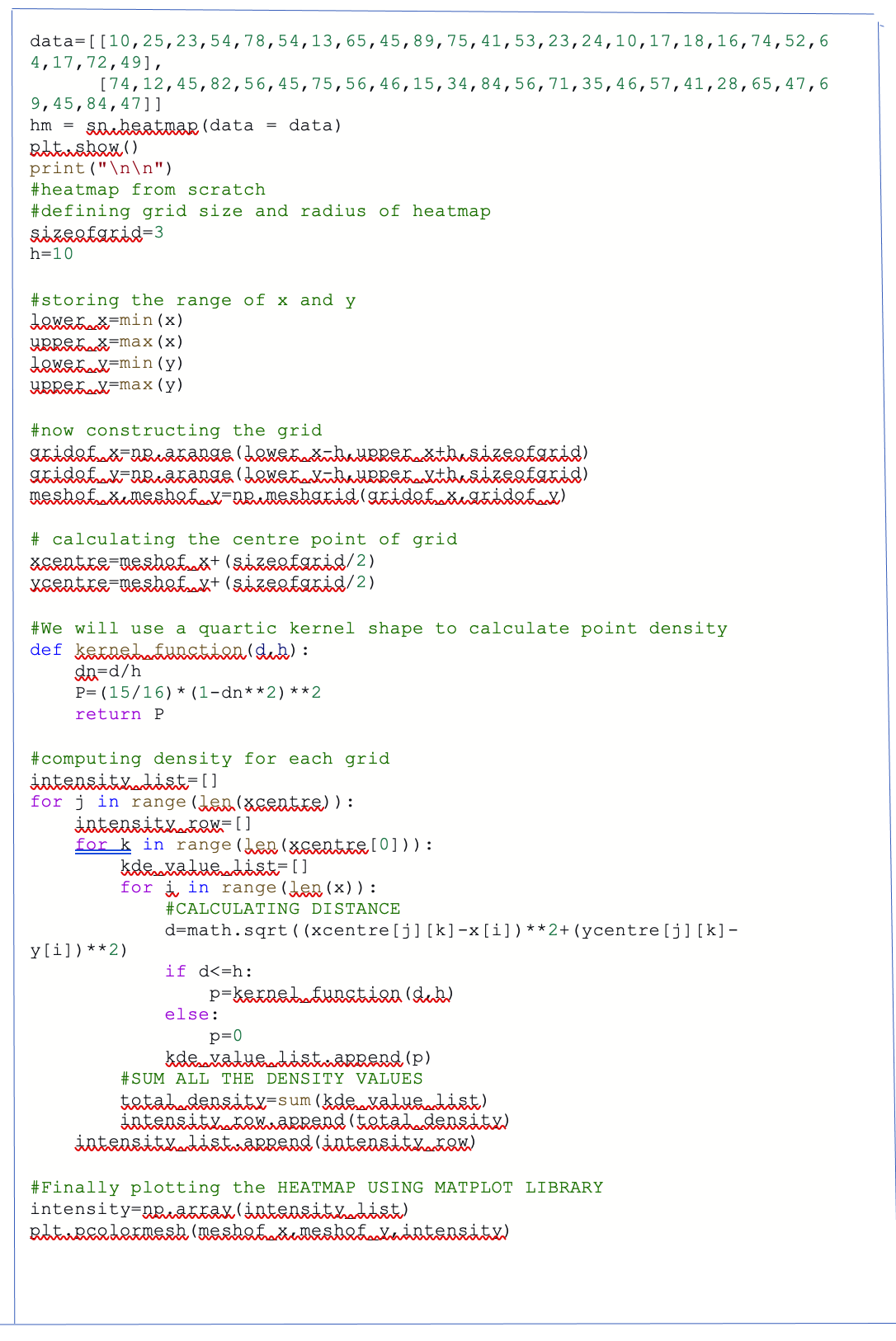
Heatmap Dataset
To build a heatmap, we need a point dataset that consists of x,y coordinates. Create two different lists for x and y.
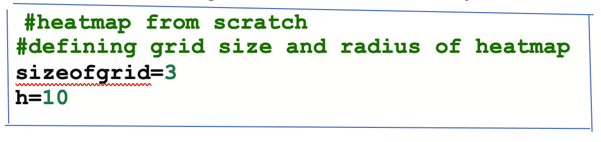
Grid Size and Radius
Define the bandwidth or radius of the kernel shape, as well as the output grid size, when creating a heatmap in KDE. For example, let's use a radius of 10 m and a grid size of 3 m.
Later these parameters can be changed to check how they affect the heatmap result.
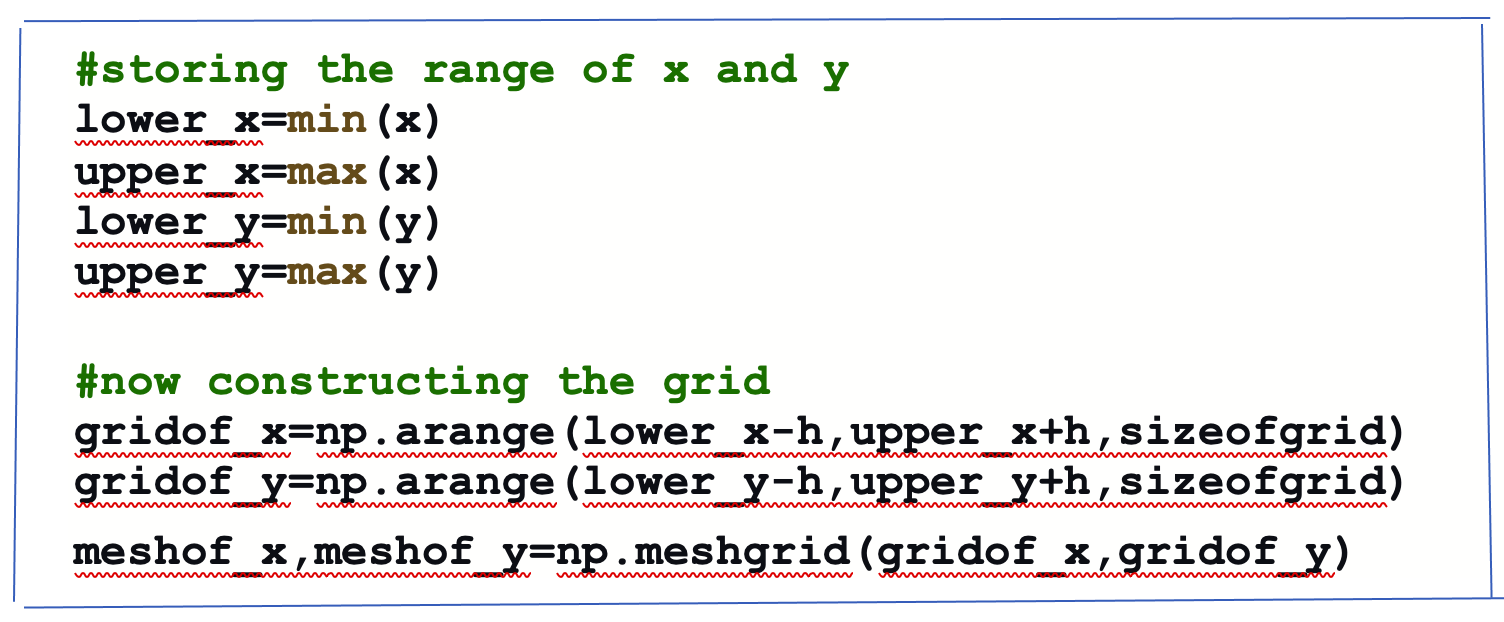
Getting X,Y Min/Max to Construct Grid
To construct a grid, we will use a mesh grid. So firstly, we need to find x,y minimum and maximum to create a sequence number of x and y. These sequence numbers then will be applied to construct a mesh grid. To combine all the dataset coverage with a little bit more space, subtract x,y minimum with radius and add it up for x,y maximum.
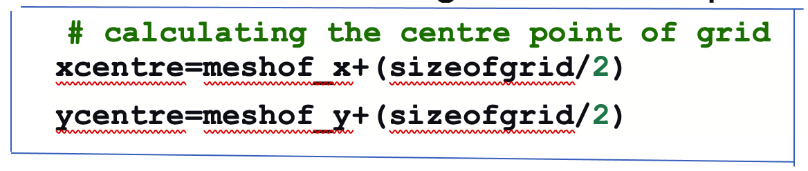
Calculate Grid Center Point
After building a mesh grid next, we have to calculate the centre point for each grid. This can be achieved by adding x mesh and y mesh coordinate with half of the grid size. This centre point will be used later in calculating the distance of each grid to dataset points.
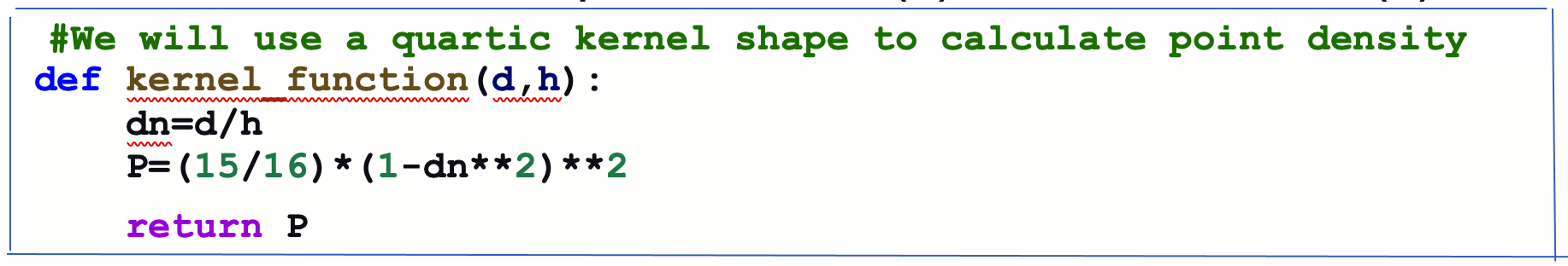
Kernel Density Estimation Function
To calculate a point density or intensity, a function that is often used is known as kernel_function. We will be using Quartic kernel shape. This function has two cases: point distance(d) and kernel radius (h).
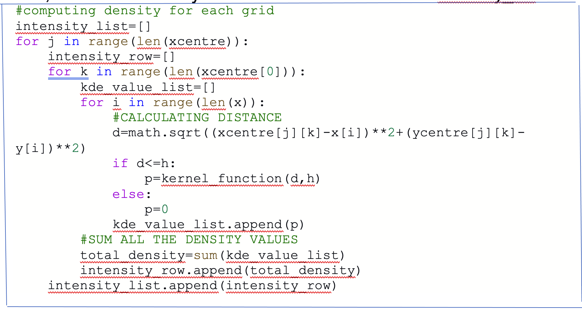
Compute Density Value for Each Grid
This stage is the most intricate part of the process. In this, we will be calculating the density value for each grid. We will perform this stage in three loops. The first loop will be for a mesh data list or grid. The second loop is for the specific centre point of those grids and a third loop to calculate the distance of the centre point to each dataset point. Using the distance, we will calculate the density value of each grid using the kernel_function function. It will deliver a density value for each distance to a data point. In this case, we are only considering the point with a distance within the kernel radius. The point outside the kernel radius is ignored, and the density value is set to 0. Then we will sum up all density values for a grid to receive the total density value for the respective grid. After
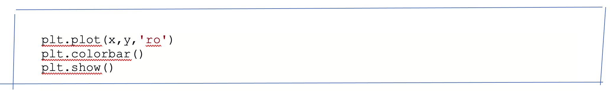
Visualize The Result
In the final stage we will envision the result with the help of matplotlib color mesh. We can also add a color bar to see the intensity value.
Conclusion
Heatmap in Python from scratch using KDE is quite easy if we follow the steps in the correct order. To learn how to create a heatmap in detail you can check out courses offered by NIIT. There are many other kernel shapes available like Gaussian, Triweight, Epanechnikov, Triangular, etc. We can add any of those kernel shapes and modify the code. Heatmaps are a very good tool for learning the connections between the features in a dataset by visualizing the features in the form of a colour palette where darker hues express a high degree of relationships and vice-versa.
SHARE


PGP in Full Stack Software Engineering
Gain expertise in front-end, back-end, web development, application development and software development technologies at different levels, which provides an edge over others in the extremely demanding field of software development. Start with a CTC of guaranteed Rs 5 LPA*
Job Assured Program*
Flexible Payment Option